

Case Study - The Doula Gal
A content-focused web design for a trust-based service
Client: Hannah Brupbacher, Certified Doula
Project: Content/Web Design and Build
URL: doulagal.com
Focus: Content Strategy, UX Design, SEO, Visual Identity

Overview
When Hannah approached me to design her doula website, her goal was clear: create a warm, informative online space where potential clients could quickly gain trust, find what they needed, and feel confident reaching out. As a solo practitioner in a deeply personal field, her site needed to do more than look good—it had to communicate trust, care, and competence from the very first click.
Strategy
I led both the content and design strategy, ensuring that the site not only represented Hannah’s personality and professionalism, but also answered the most important questions new clients typically have—both for usability and SEO purposes.
Content Highlights
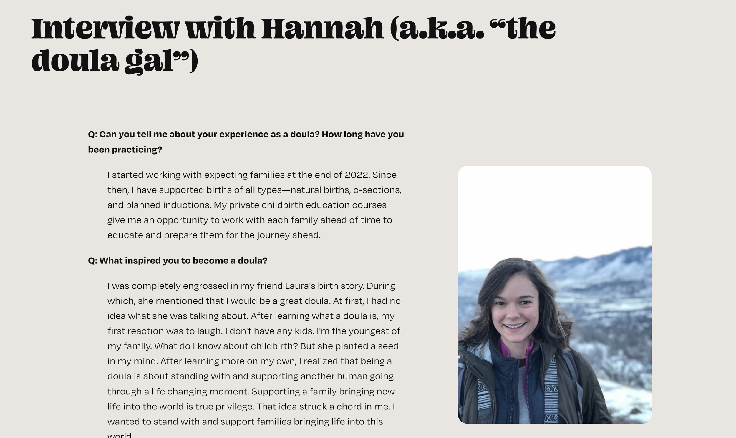
1. Interview-Style About Page
Rather than a traditional “About Me” bio, I crafted an interview-style format to:
Build a more intimate, conversational tone that helps users feel like they’re getting to know Hannah personally.
Seamlessly answer key SEO queries like “What does a doula do?” and “Why hire a doula?”
Provide clarity around her philosophy, credentials, and experience in an engaging and digestible format.
This approach allowed the About page to work double-duty: fostering emotional connection while boosting search relevance.
2. Action-Oriented Homepage
From our early research and client insights, we knew most visitors were coming to the site with two immediate questions:
How much does this cost?
Is this doula any good?
To meet users exactly where they are, I placed two high-visibility buttons at the top of the homepage—“Pricing” and “Reviews”—making it easy for visitors to get the answers they need without having to scroll or dig.

3. Highlighting Certifications Up Front
In the doula world, certifications matter—a lot. To reflect this, I gave Hannah’s credentials prominent placement in both the homepage and About sections. By visually emphasizing her certifications, I reinforced credibility and professionalism while aligning with what users care about most when choosing a doula.

Visual Design
Hannah wanted the website to reflect her brand’s softness and calm, while still feeling modern and trustworthy. I designed the Doula Gal logo and drew inspiration from the floral motif on her business card, which she asked me to incorporate into the site. I used this as a springboard for the site’s color palette and design accents, creating a visual continuity between her offline and online presence. The end result is a cohesive, welcoming design that feels deeply personal—just like the work she does.

Results
Though this was a newly launched site, early feedback from users and prospective clients has been overwhelmingly positive. The clear content, approachable tone, and easy-to-navigate layout have made it a useful resource—not just a business card.