Neighbors | Mobile Application | UX/UI Design Project
Design tools used: Figma, MAZE
Project duration: 2 weeks
Role: UX Researcher, Designer, Writer

Project Overview
Neighbors is a forum-community mobile application based on location. My client wanted users to be able to move around on a map and see posts in specific areas as opposed to one general search area.
My client was a software engineering manager with a lot of knowledge about building applications. With their experience and my specific interest in user psychology, together we were able to come up with a mobile app idea.
Problem Statement
Users need to be able to populate a forum search through their chosen location and search radius. Users also should be able to interact with the posts by having their own account, display name, and profile. Along the process, encourage users to make real-life connections with their neighbors in a different way than they may have done previously.

Project Goals
Given that I only had two weeks for the research and design phase of this app, I set my sprint goal as specific as possible.
I decided on three main user experiences to focus on designing for.
Locating forums in a specific geo search.
Creating an account.
Viewing posts and commenting.
Before getting carried away, it’s important to determine who I’m designing for.

Competitive analysis
On first hearing the idea for this app from my client, I immediately thought it sounded like a combination of Reddit and NextDoor. To set out, I wanted to learn what they were doing right and what I could improve on for this specific project.
One of the most popular forum platforms in the US, if not the world, with near infinite niche topics.

NextDoor
Nextdoor is another app that immediately came to mind in early discussions about Neighbors. As a community app that focuses on local communities and creating a space for knowledge-share and events, it meets the requirements of a competitor for our app.
Nextdoor appeals to a different market than Reddit and meets a more specific niche that is similar to our proposed application.

User interviews

Those I interviewed expressed a general interest in the concept me and my client were proposing. The biggest issue to tackle was how to create a sense of community and encourage real-life interaction in an online-based application.
How might we …

Asking “How might we … “ helped to determine which user problems I needed to focus on designing solutions for. From there, I could start crafting the user experience.
Journey map & Empathy map
Using a journey map, I imagined what steps a user might need to take in order to use Neighbors to reach their goals.

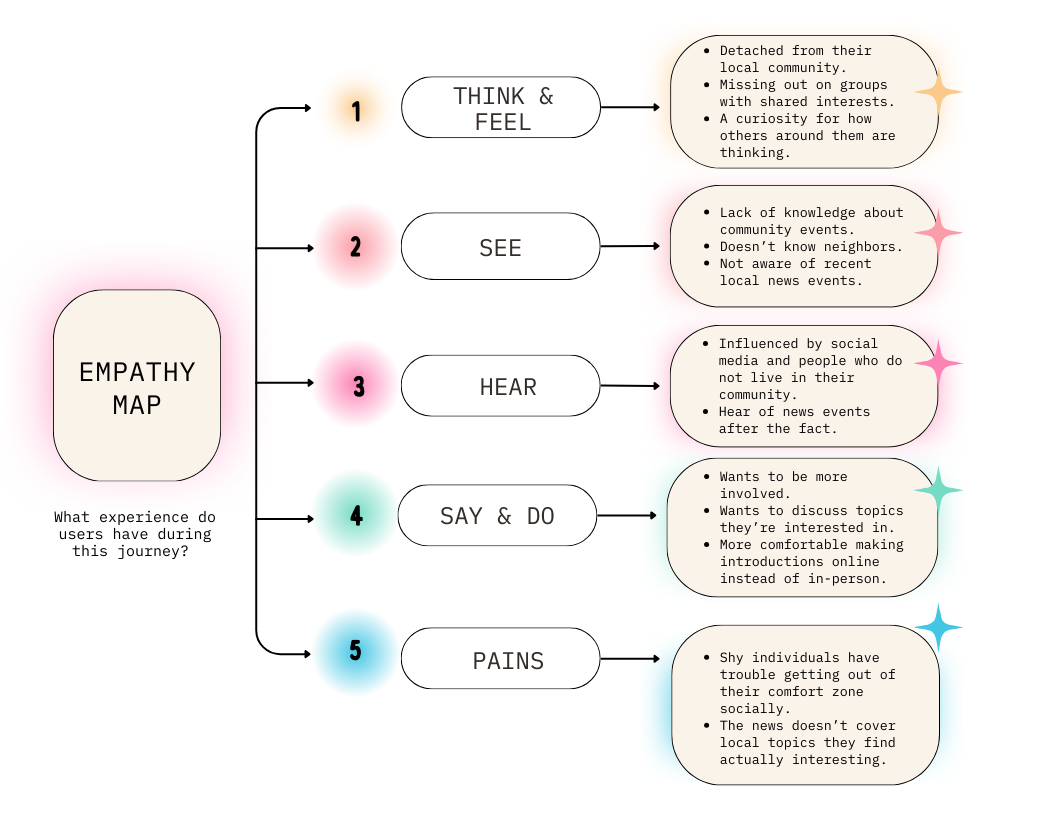
With an empathy map, I try to get into the same headspace as my target users. I try to imaging what they are thinking and feeling and what factors are influencing their decisions.
Wireframes
With some research completed, it was finally time to start making designs. Wireframing allowed me to explore different page layouts and interaction flows without spending too much time on aesthetics. This phase also gave me the opportunity to test those design ideas with flexibility.
Solution sketches
Early decisions
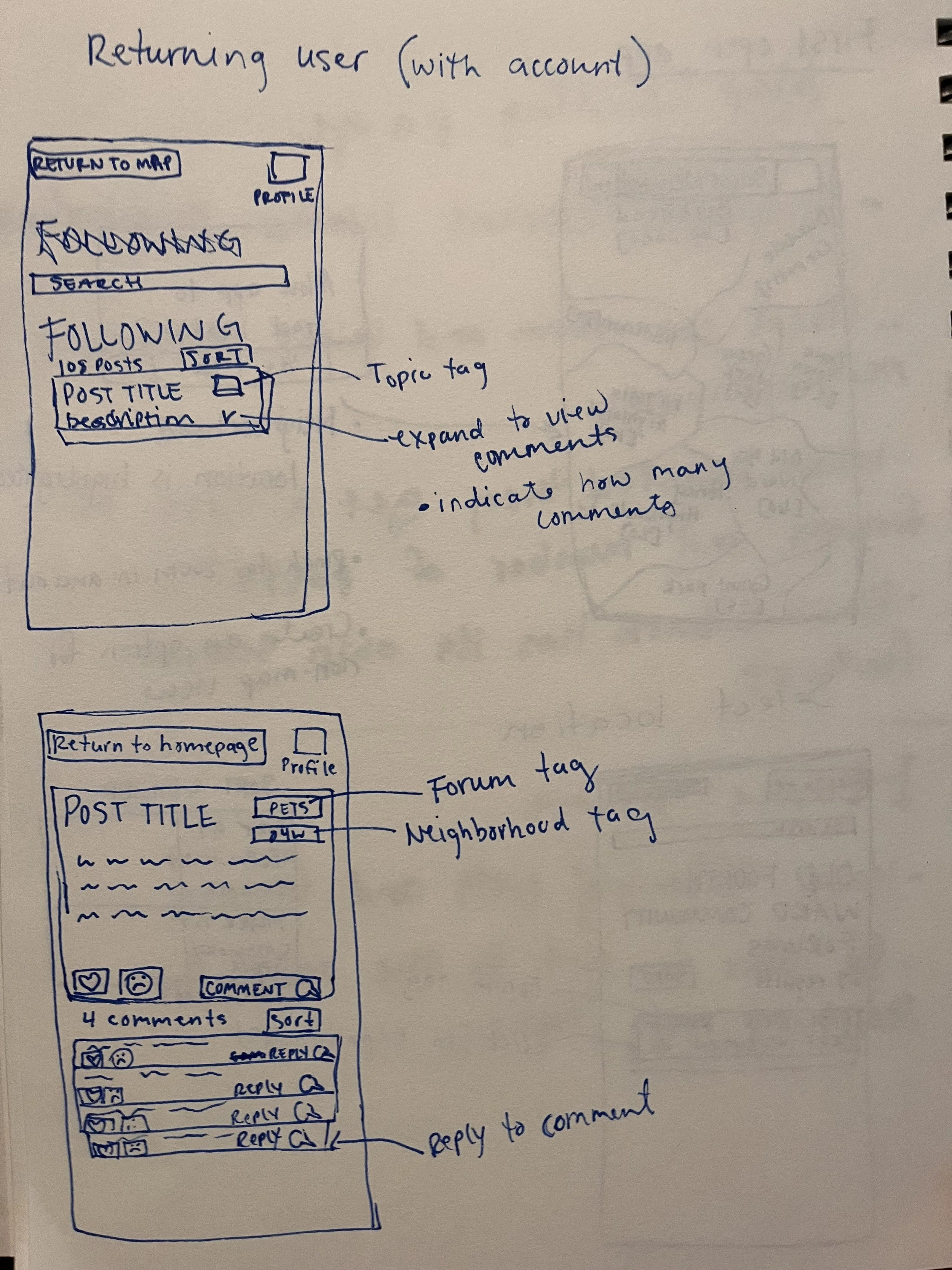
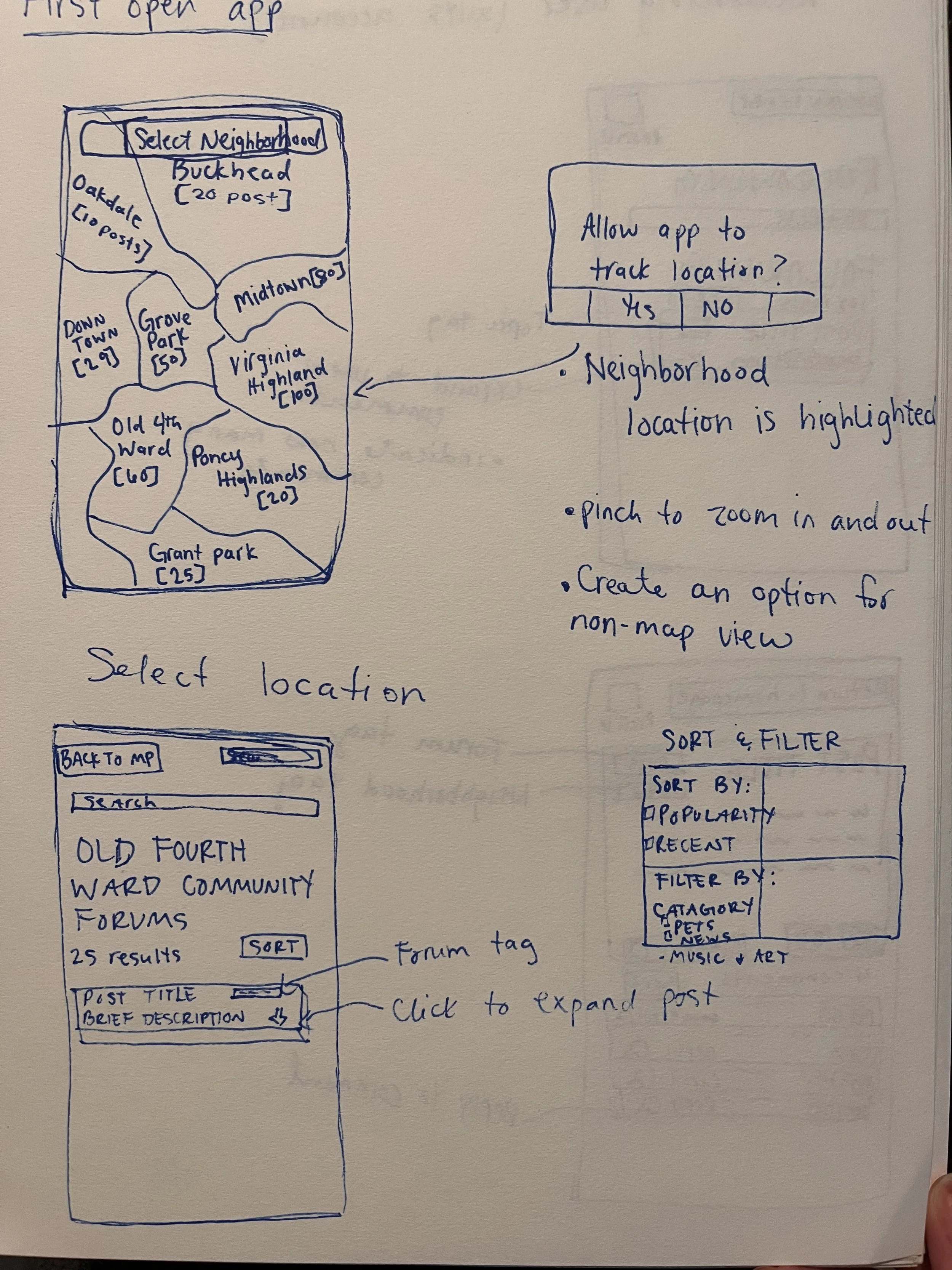
Have a map with neighborhood boundaries, and allow users to select the neighborhood whose forum they want to explore.
Once a neighborhood is selected, users can sort posts by popularity and search topics of interest within the neighborhood boundary.
Have users create an account to interact with posts and follow topics of interest.
Paper prototype
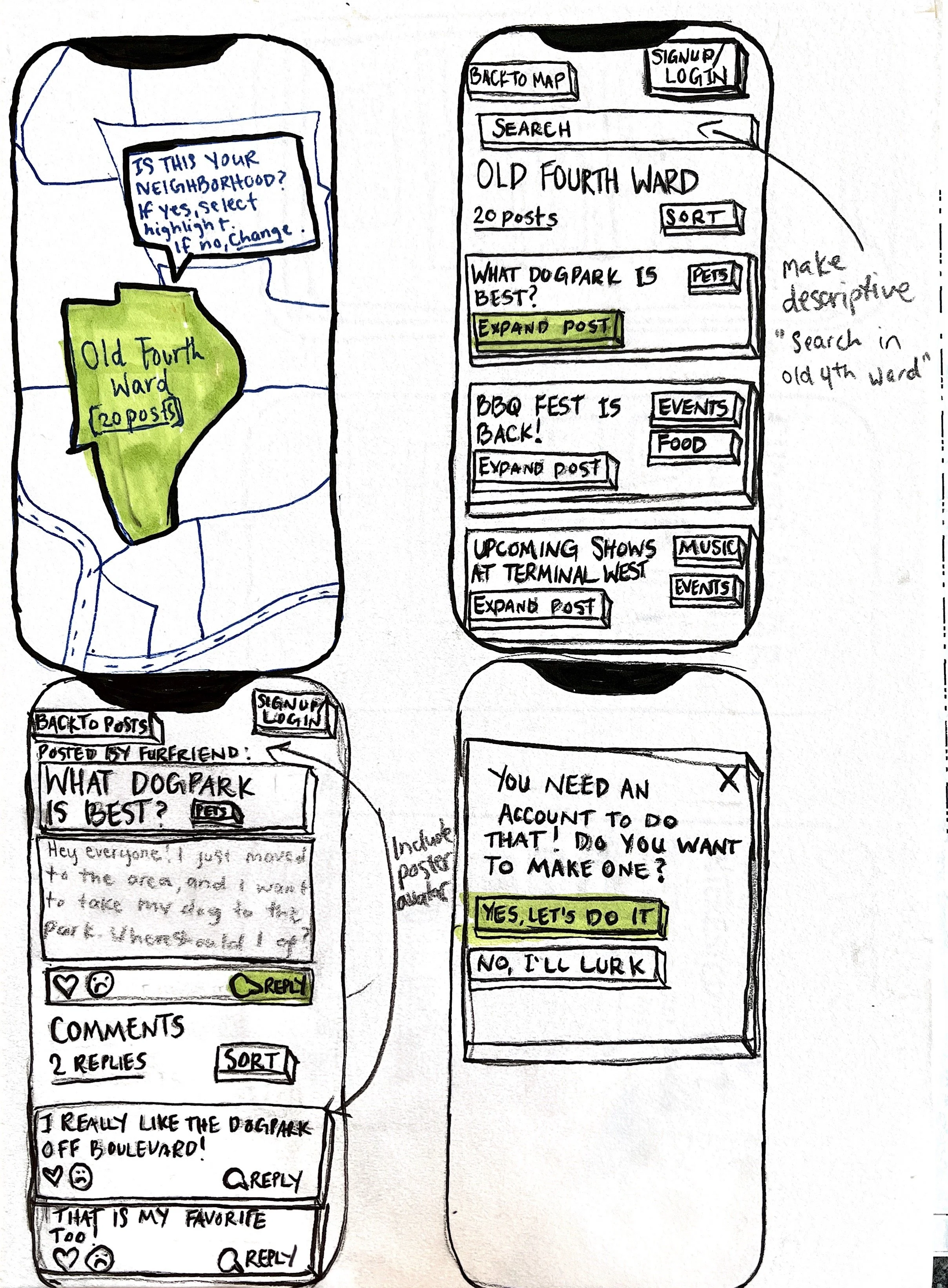
I used drawings to imagine how the app would look in real life and do some user testing before even opening Figma. I got feedback from friends and family and made notes for the digital design.
Feedback from paper prototype testing included:
Using the neighborhood name in search bar so users don’t confuse which neighborhood they’re currently searching.
Including the poster avatar and name at the top of posts.
Sorting categories in the search feature alphabetically.
Digital wireframes


User interviews & testing
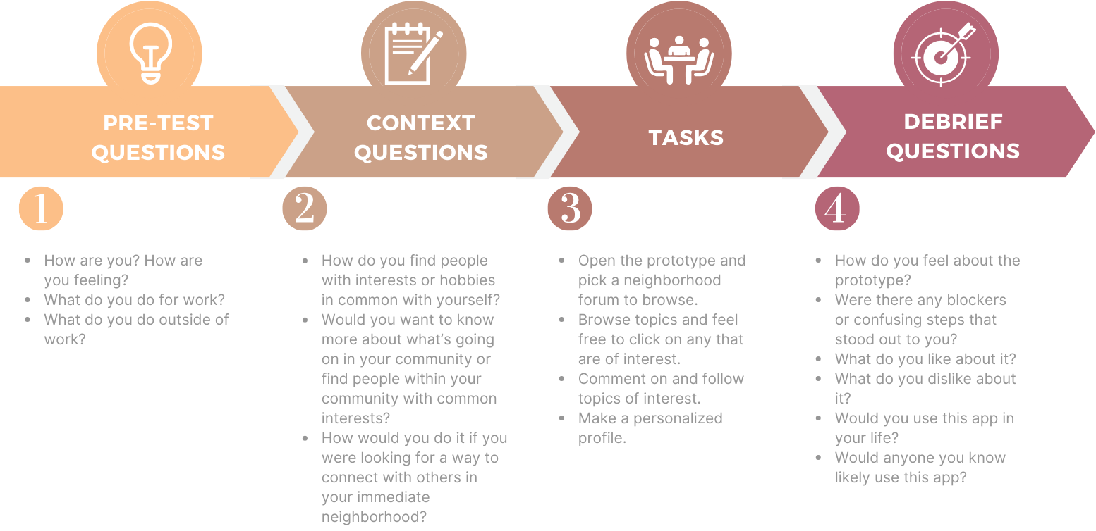
(Semi-)Final designs
After observing testers interact with the wireframe prototype, I made some minor adjustments to fix issues that arose. At this point, I also started making stylistic decision.
User flow designs
User flow 1: Opening app and geo-locating


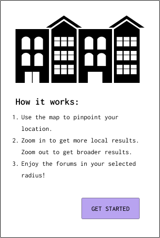
I changed the map screen to automatically locate users and search in a designated radius. This way, users are not limited to their home zipcode but can search forums wherever they are.
To improve accessibility, I added an alternate way for users to input their search radius.

User flow 2: Creating an account
Initially, I wanted to have users select a user icon, like Reddit. However, one major difference between our application and other forum apps is the importance of community and connection. Allowing customizable profile pictures allows users to put a face to the content.

User flow 3: Sorting posts

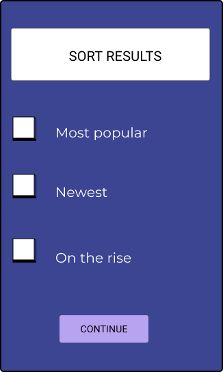
Being able to sort posts is an essential UX feature to any forum app. The easier and faster it is for users to find the information they need, the better.
User flow 3: Commenting on posts
The comment section was one of the sections I had the most changes to. I ended up getting inspiration from how Reddit organizes comments from multiple users.

