
Introduction
SmartStash is an AI-based tool for households to track their fridge and pantry contents. No smart fridge is necessary.
Purpose
Design a website for registering a SmartStash device and using the website dashboard to track items.
Tools used:

Summary
Users need a way to easily track their food storage to collaborate with family and household members and avoid food waste and eat healthier. Can users do this in three steps or less?
The solution
A brief snapshot of the results of this design sprint (to be followed by the detailed process)


Phase one:
Research
Research methods used:
Surveys
polls
User interviews
Competetive analysis


What are competitors doing?
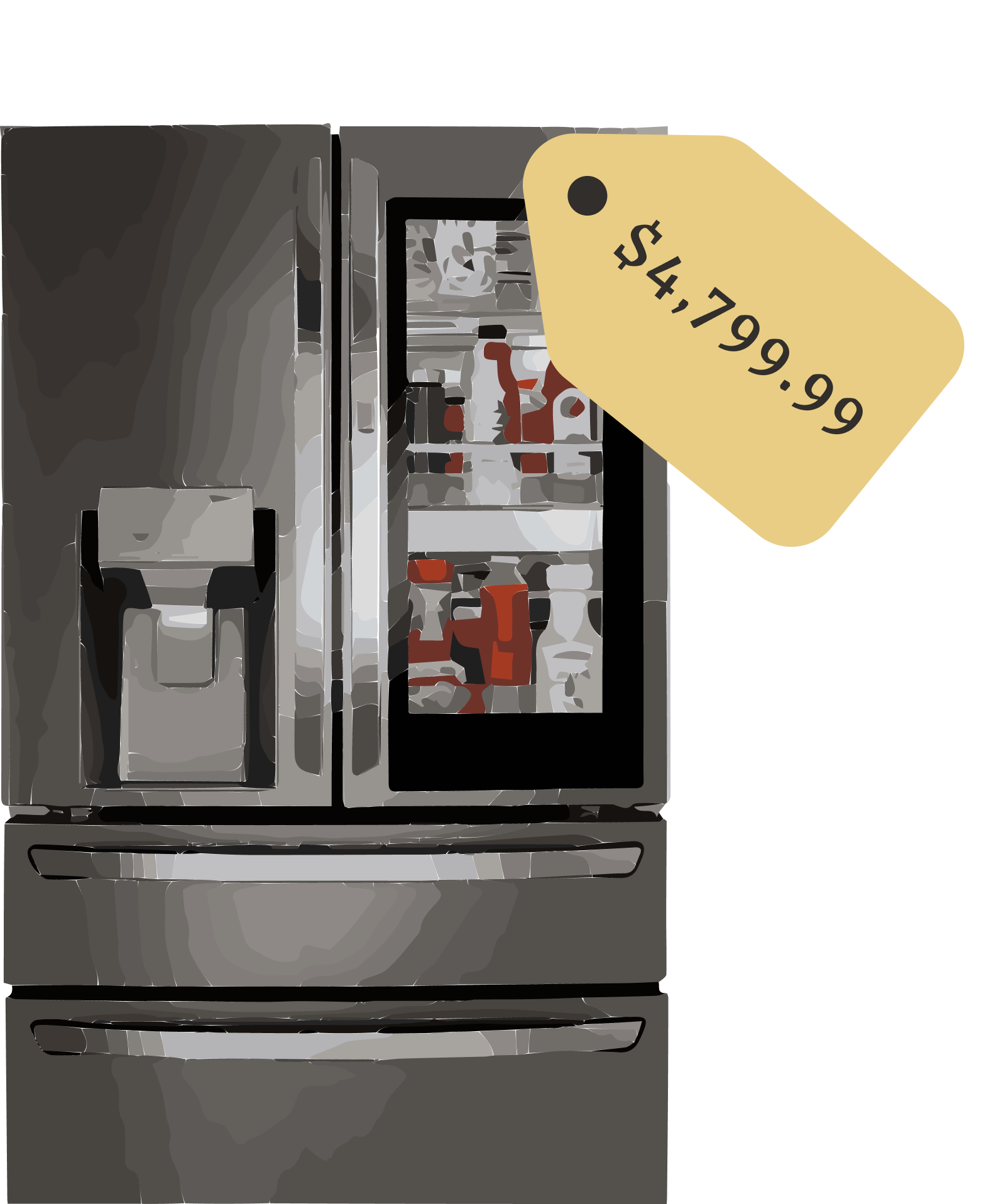
AI-enabled fridges
Pros
Track fridge inventory in real-time
Create shopping lists based on current inventory
Get notifications for restock needs
Cons
Cost in inaccessible for most consumers
Encourages waste by requiring consumers to purchase a new appliance despite current fridge’s status
Only tracks fridge content, not pantry or other
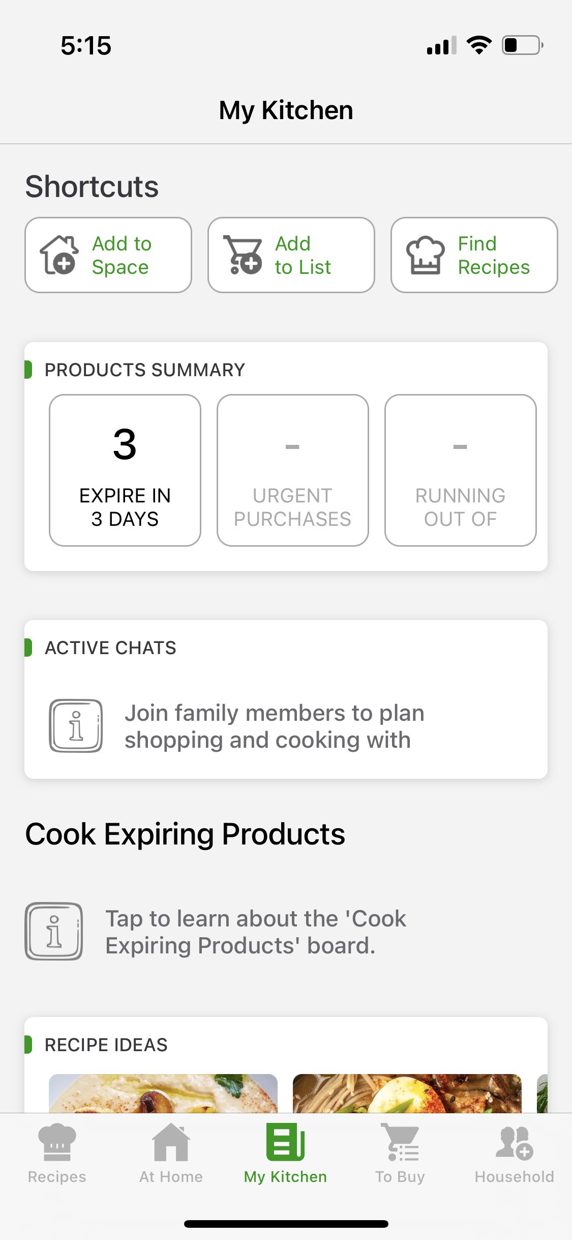
Food storage tracking apps (CozZo, CookList)
Pros
Affordable and accessible
Allows multiple users on one account
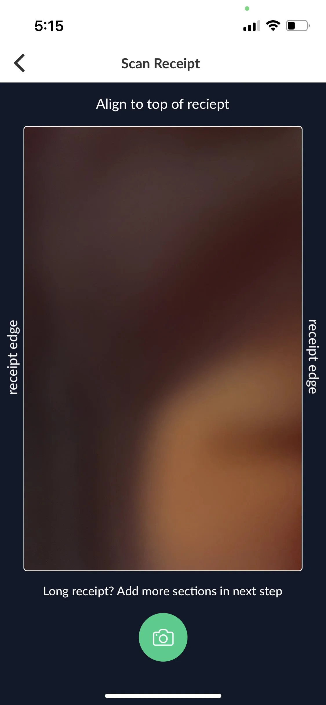
Upload receipts through with phone camera
Cons
Doesn’t use AI capabilities
Requires manual inventory updates
Confusing AI with sharp learning curve
Example: Upload a receipt with phone camera
Example: Required to manually edit inventory
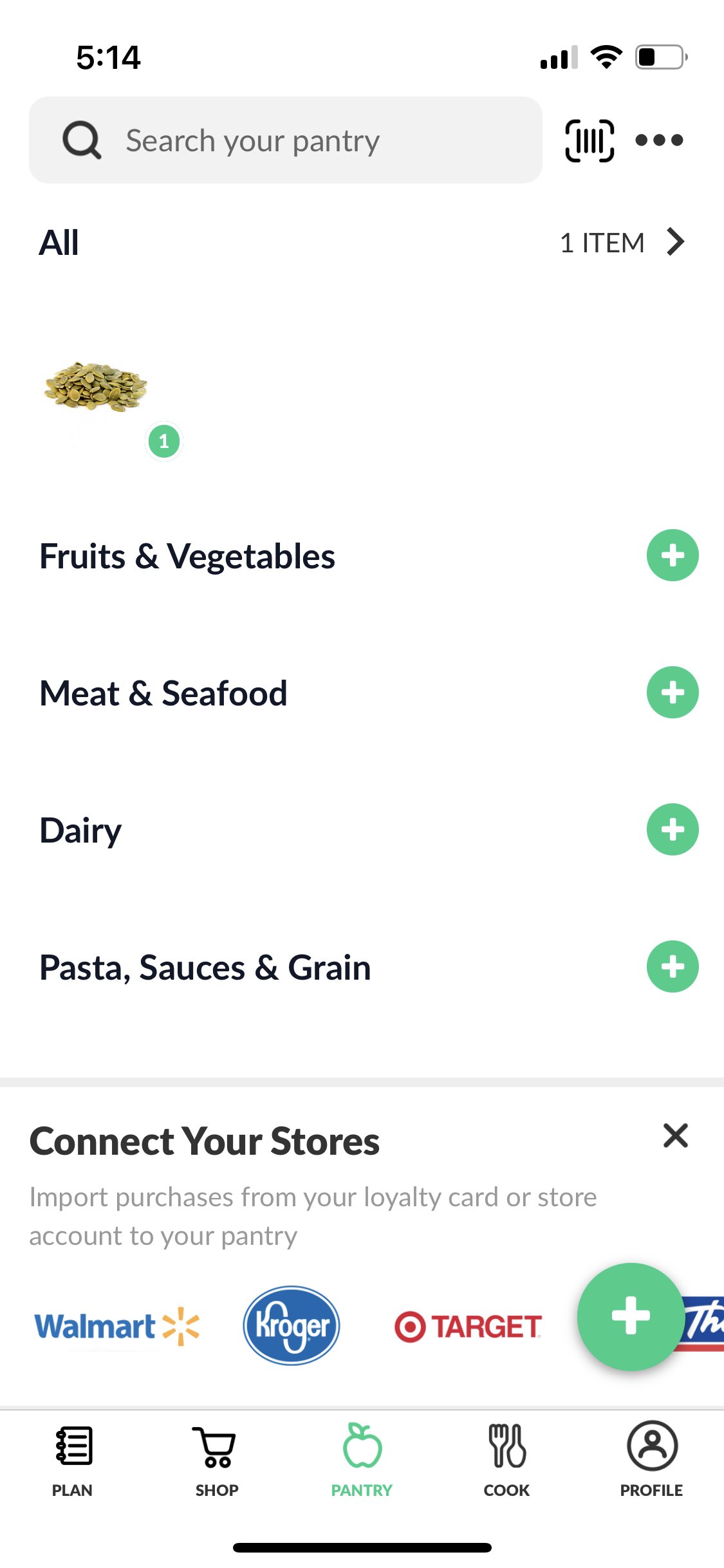
Example: Clunky and confusing UI with sharp learning curve
Poll and survey findings
Over half of survey participants don’t know if anything in their fridge is currently expired.
Almost half of participants grocery shop without a plan.
Is anything in your fridge expired right now?

Those I interviewed said …

“When I don’t have a plan at the grocery store, I end up making unhealthy decisions.” - John, age 32

“I have no idea what’s in my fridge right now, especially condiments.” - Taylor, age 26
User-centered design goals for SmartStash:

Users want an application that simplifies making healthy decisions at the grocery store and helped to reduce overbuying habits.

Since users are busy, the usefulness of the product needs to outweigh the effort it takes to use.

The app should be faster, and more intuitive, than using a notes app on your phone to create an inventory list.
User personas


Phase two:
Define

Early wireframe sketches
At this point, I started to imagine how a desktop application for this device might look, as well as how users might interact with it.
Early on, I knew I would need at least 4 pages.
A home page
A signup page
A home dashboard
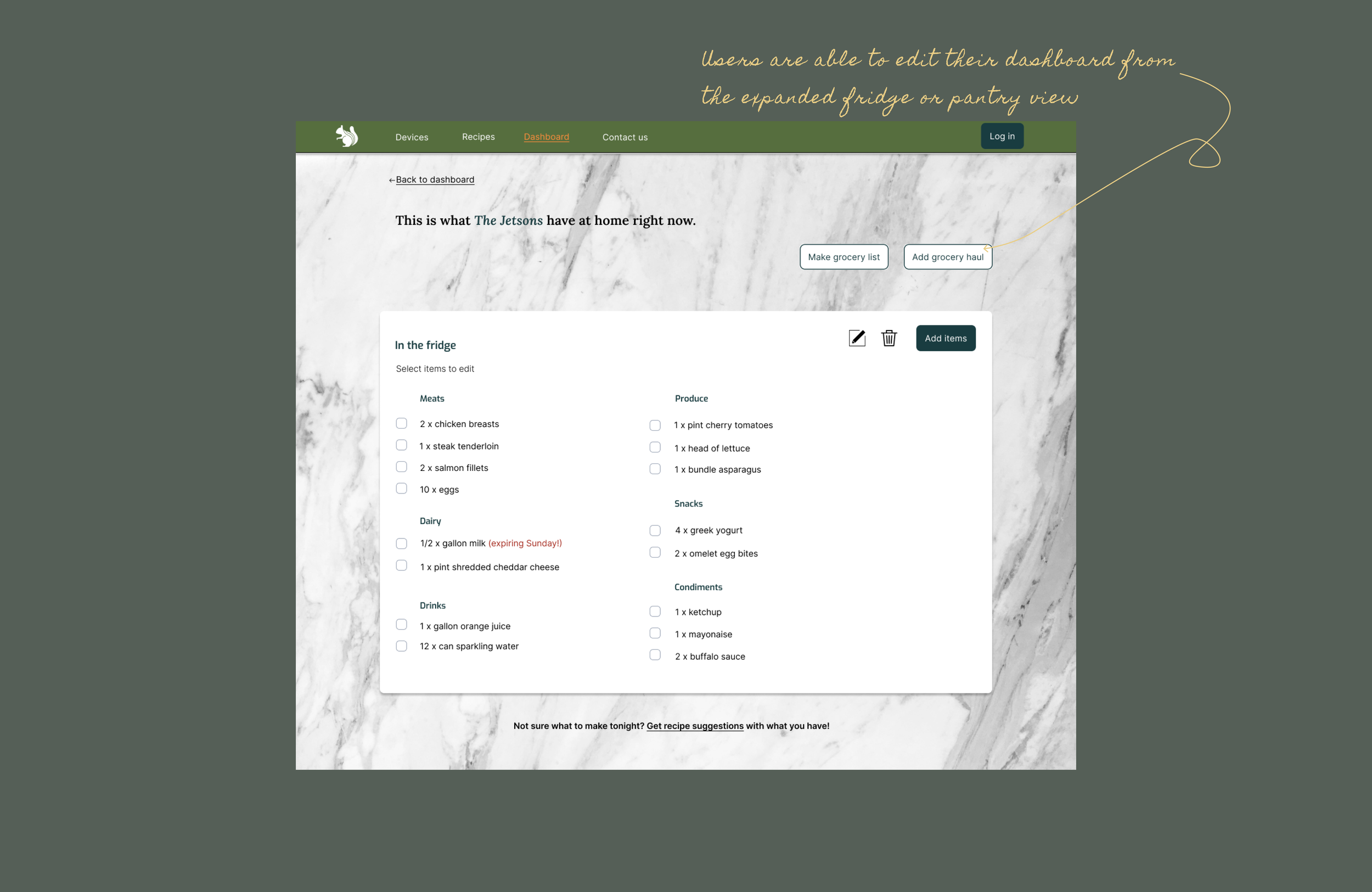
Specific editable dashboards for specific spaces

Key design elements to keep in mind

Wireframes
My first set of wireframes were digital copies of my initial sketches.
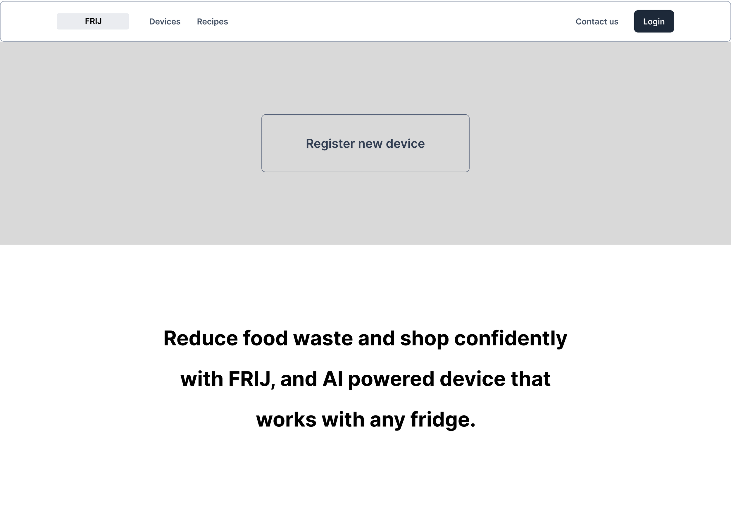
From the wireframes, I could start to define what other interactions and features I would need to design for in addition to those essential screens from early sketches.


At this point in the process, I also began acquiring as much feedback as possible, including from individuals with experience using AI-enabled home appliances.
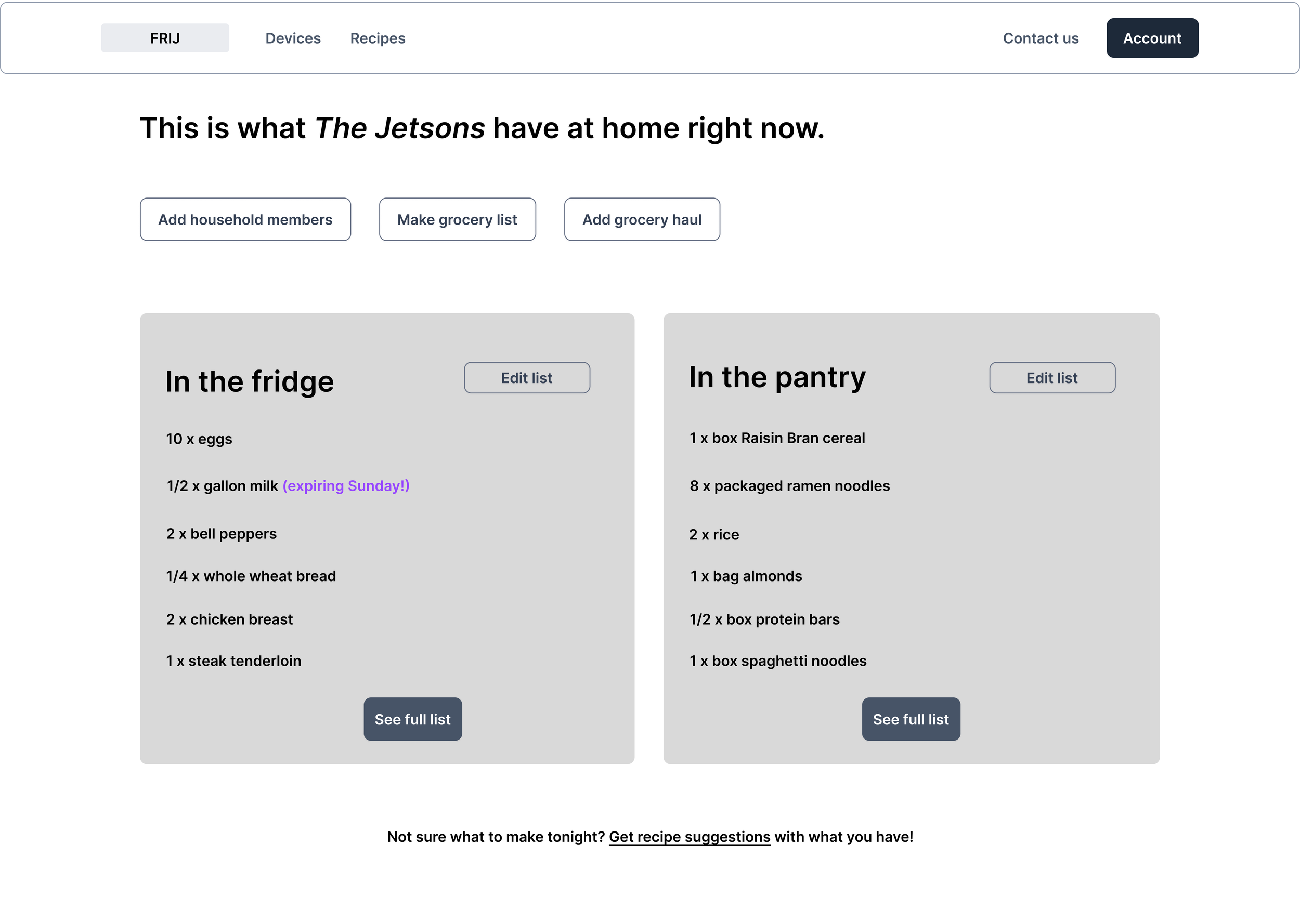

Selectable actions became the easiest way to edit lists.


User accessibility best practices are to always make sure users cannot accidentally complete an action.

Even though this design sprint did not focus on a mobile app, I wanted to show briefly how the mobile app would coexist with the desktop app.
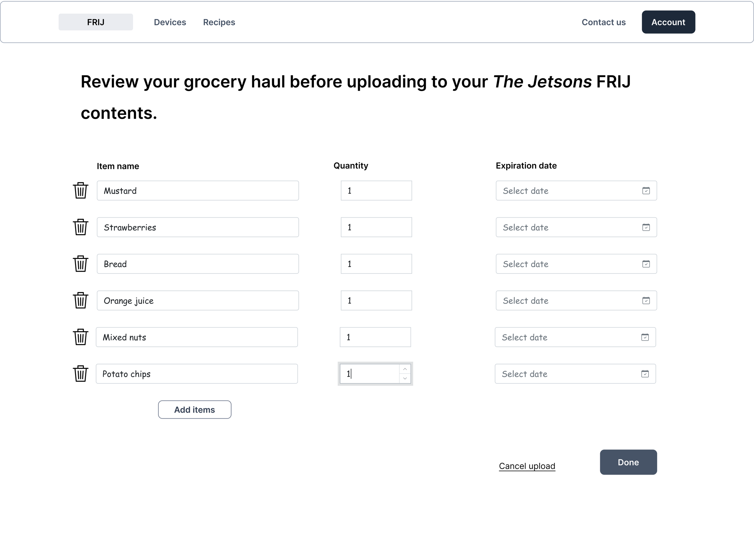
It was at this point, I began getting feedback from user testers that prompted some changes to the user interactions.
Iterate, iterate, iterate

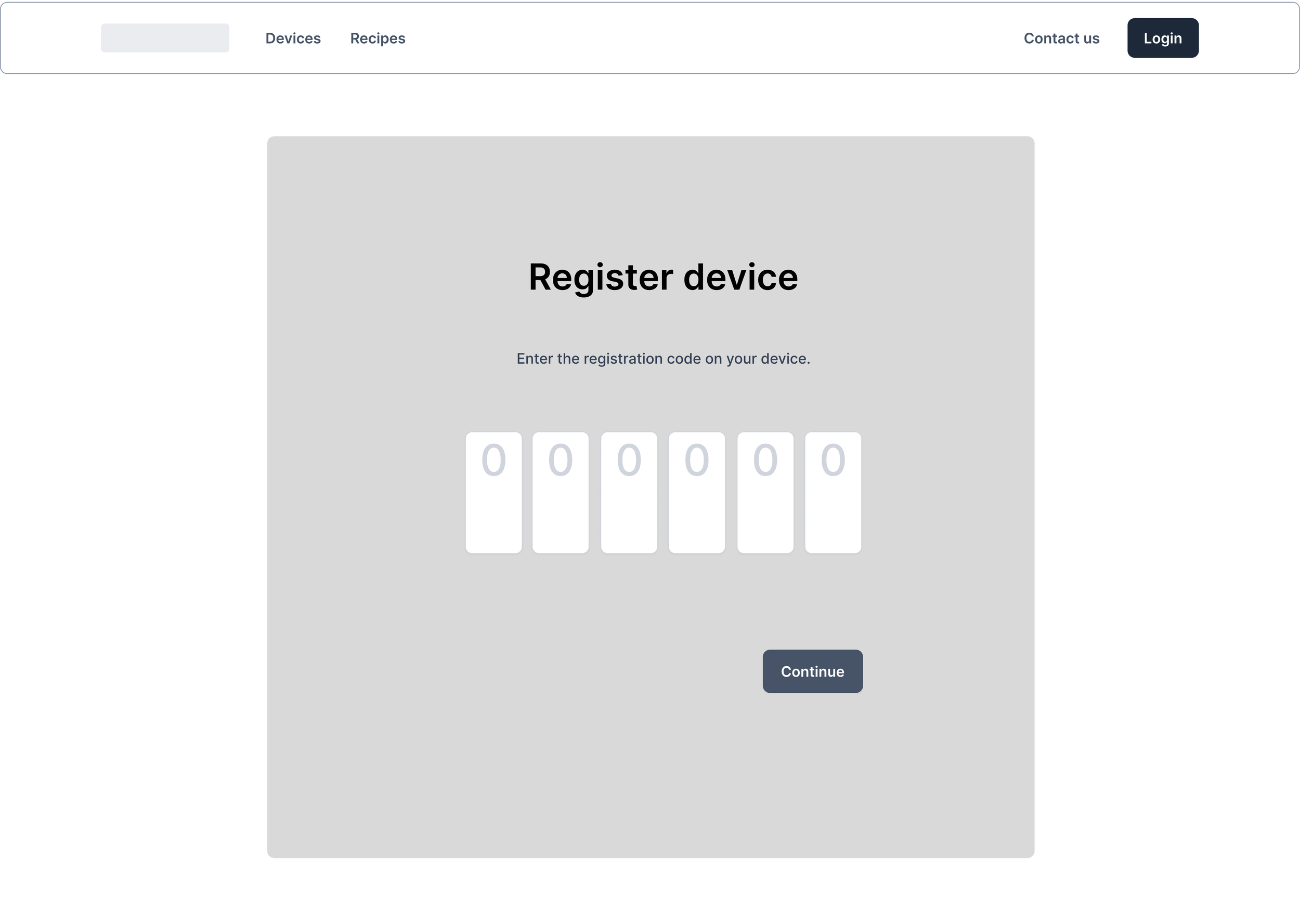
After learning more about how AI-enabled home appliances work, I modeled the “Register device” interaction after how existing processes including a model number and a specialized registration code.
To simplify the dashboard and decrease the number of words on the page, I used icons to represent household members.

After uploading a grocery haul through the mobile app, users can confirm which dashboard their items will occupy through a toggle switch. They can also delete, edit quantity, or add an expiration date as needed in one single page.

Phase three
Designing the user interface
Brand development
Name & Logo

Using AI, I created a list of possible names. SmartStash was the closest to the app’s function and the most pleasant to the ear (I’m a fan of alliteration).
I chose a squirrel as a logo because they’re known for stashing food beneath the ground, much like the app name. I also wanted to promote sustainability, and a cute animal seemed to do that best. Market research interviews confirmed the selection as a good representation of sustainability and savvy-ness.
Colors and aesthetics

I used natural elements as inspiration to emphasize sustainability and healthy food choices. User interviews revealed that many view shopping and organizing as stressful tasks. Relaxing cool colors help to soothe some of those feelings.
Components
I’ve found that the earlier in the process I create components and their variables, the easier it is to implement them into the AI. Here, I started on designing a component library. Below you’ll find the main components and their hover states.


Font


Mockups: Putting it all together
Early user testing and iteration during the wireframe stage, and lots of prep work with deciding on UI element styling, contributed to creating realistic and stylized mockups with only a week left of the project.
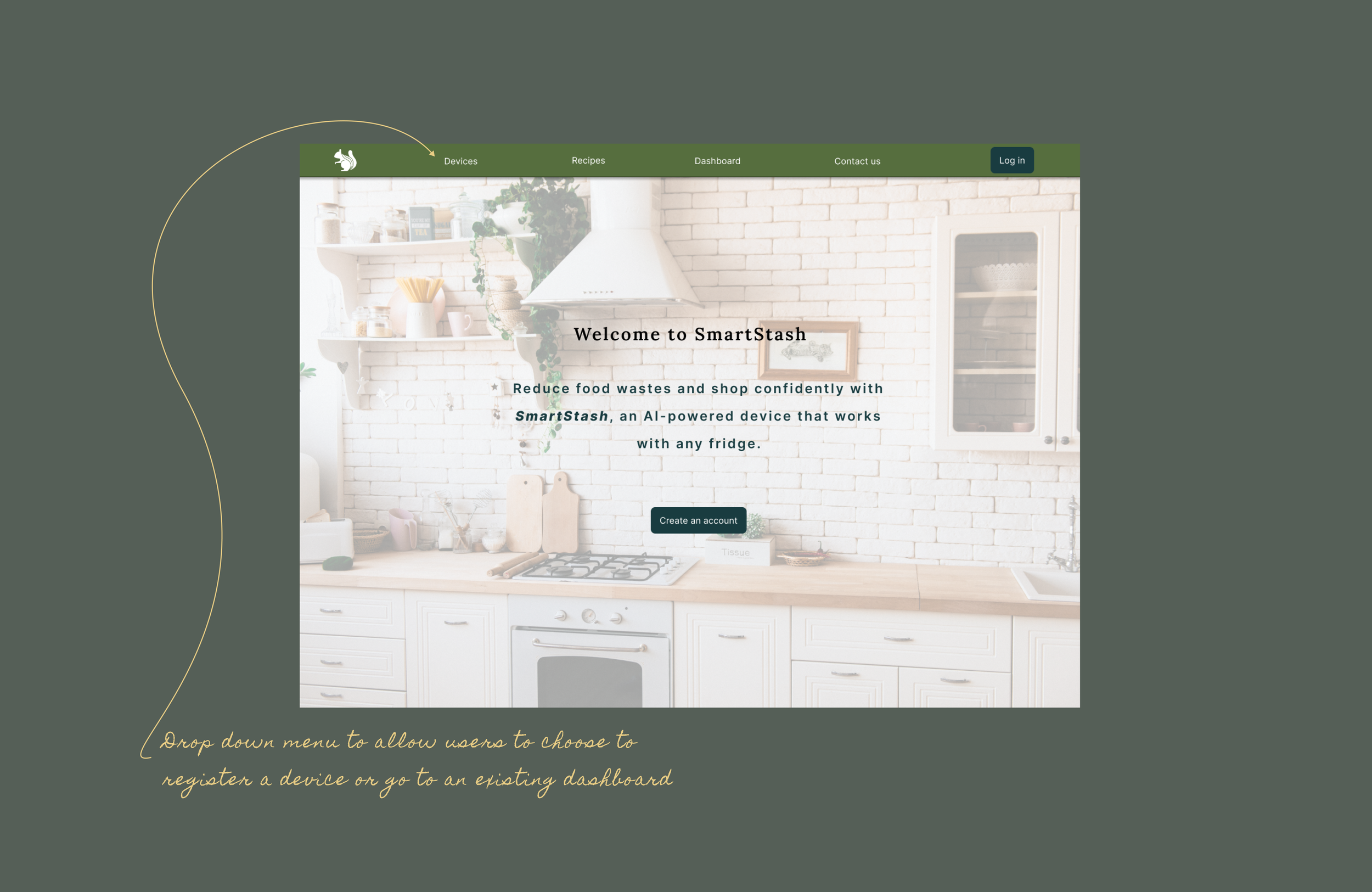
User landing page

Creating an account and registering a device


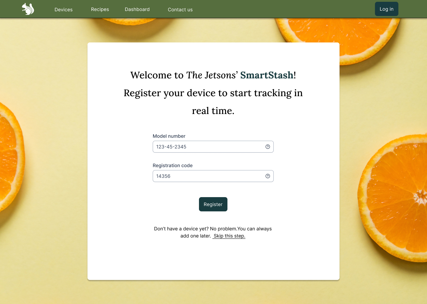
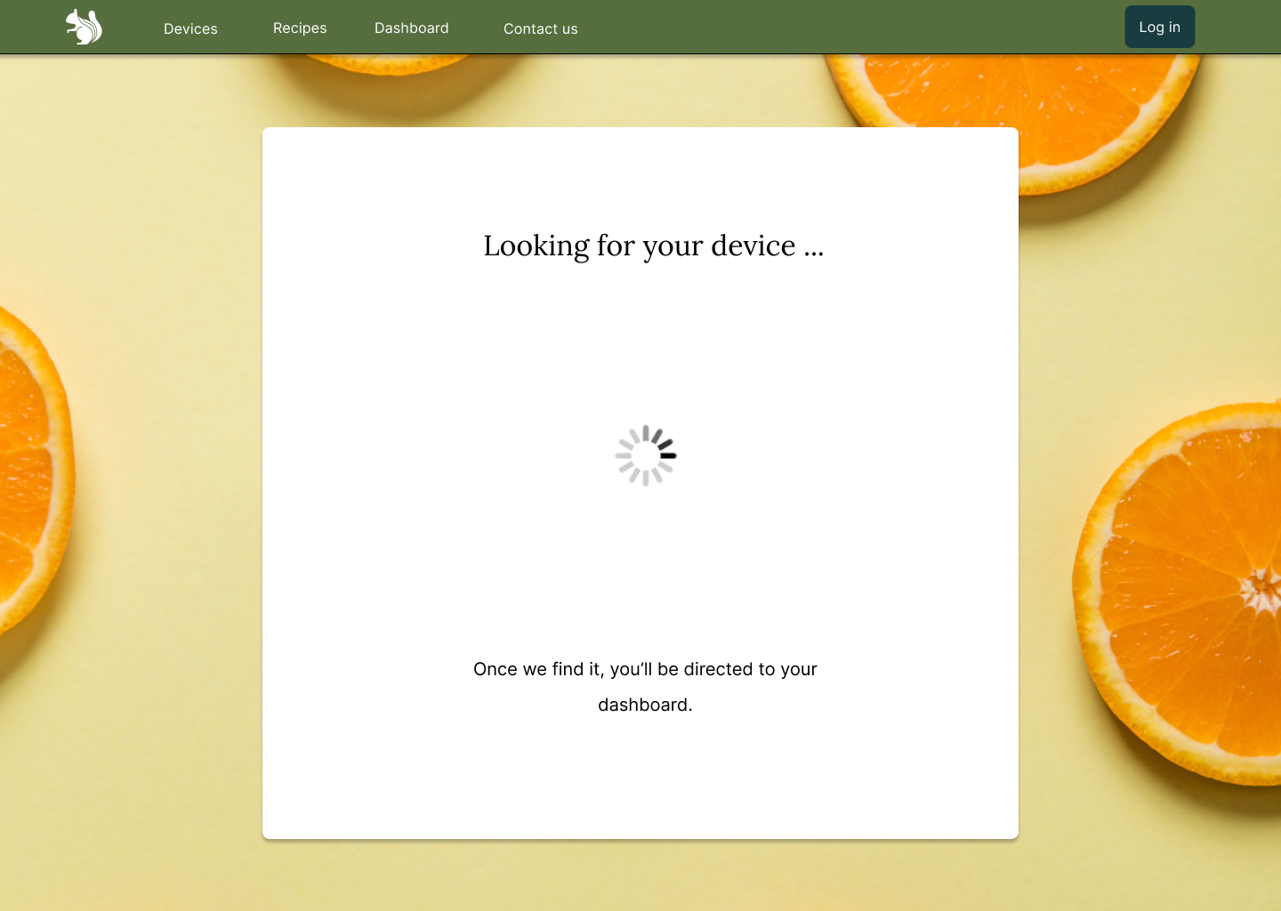
Viewing and editing the dashboard
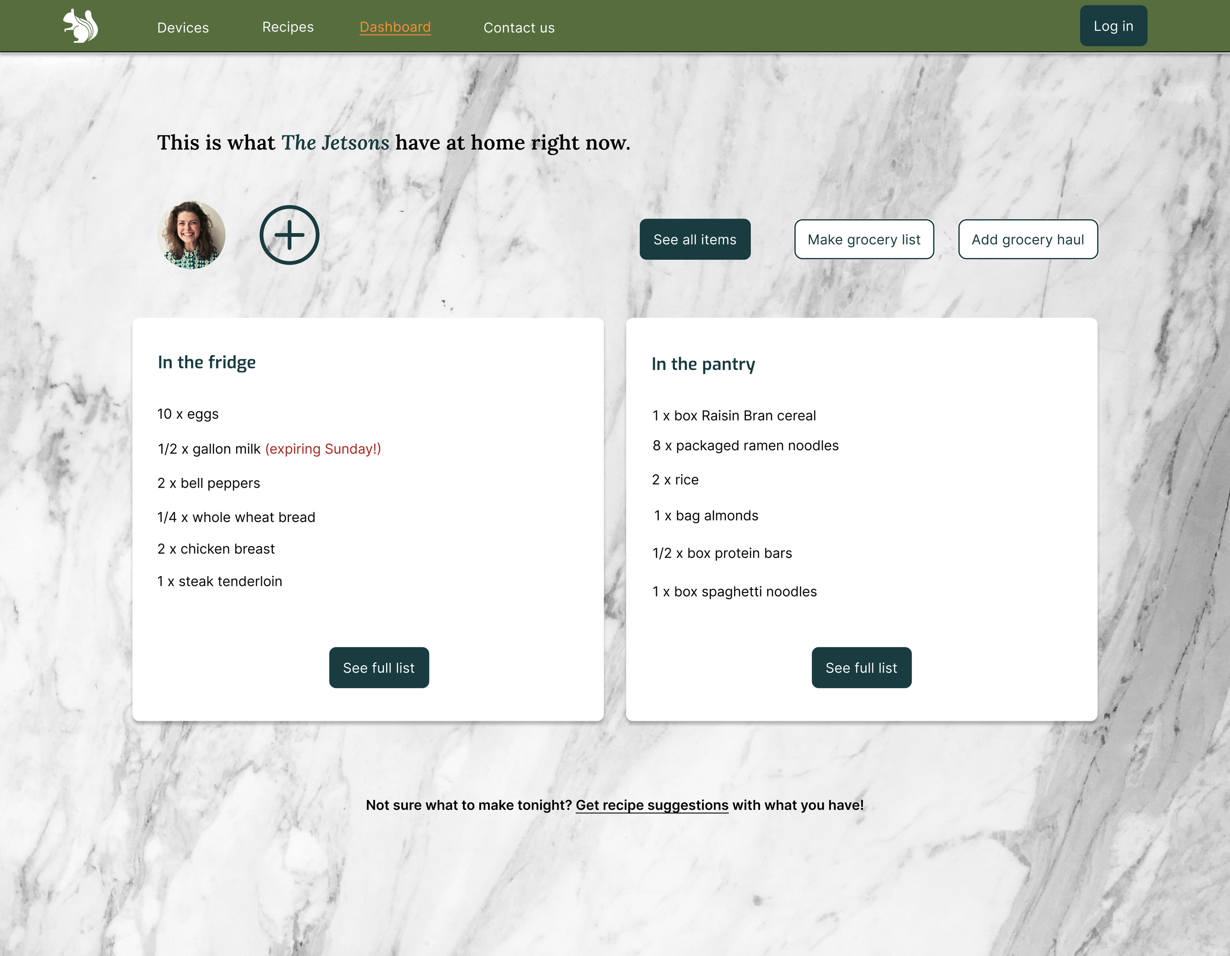

Watch the interactions in the prototype.
Adding a grocery haul
The mobile app is not developed, but when it is, this is an idea of how the two might interact.

Review the upload and confirm the location of items.

Conclusions
This project gave me great experience in the following:
Gaining insights from user research and user testing.
Crafting a login experience.
Creating user feedback and designing micro-copy.
Developing a clickable prototype in Figma.
What I learned:
The more time spent in research and development, the smoother the design process.
User testing at every step is essential.
How to create small-scale custom design systems using Figma tools.
